- +1 512-591-8295
- [email protected]
- Mon - Fri: 9:00 - 16:00
- +1 512-591-8295
- [email protected]
- Mon - Fri: 9:00 - 16:00
Use code MOM50 at checkout thru Mother’s Day to get 50% off any gift card for marketing services
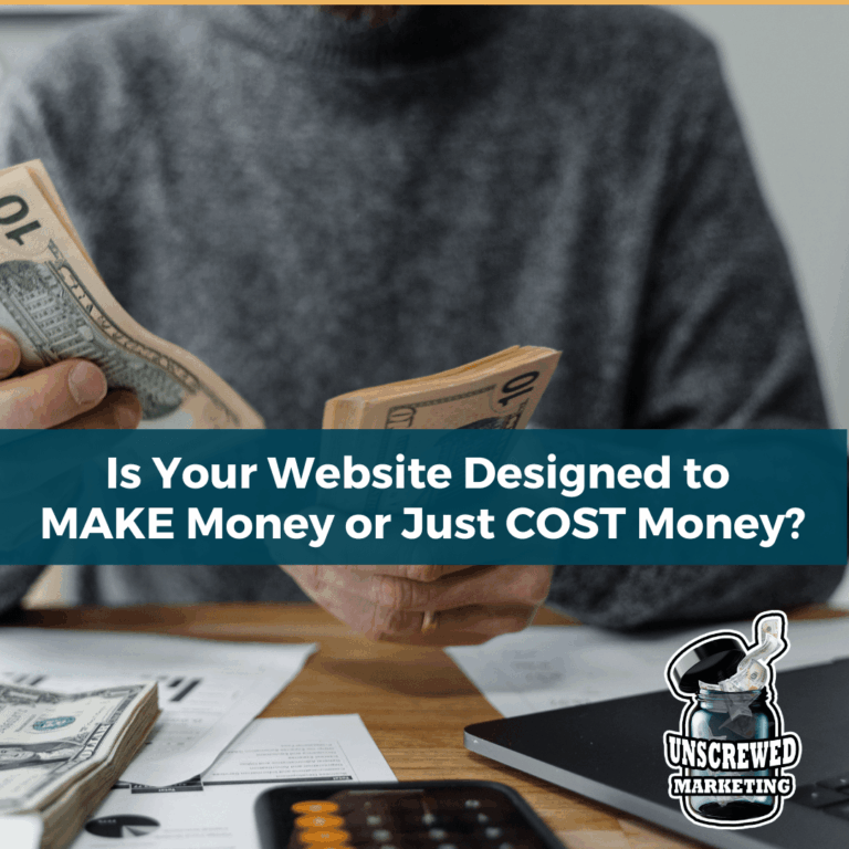
I’ve seen it too many times. An entrepreneur spends thousands, sometimes tens of thousands, on a shiny new website. It’s got the glossy visuals. It loads decently fast. Maybe it even has a few bells and whistles tossed in like a newsletter popup.
But six months later? That site still hasn’t brought in a single client. Or worse, it’s a ghost town. Little traffic. No leads. No list growth. No ROI.
The problem isn’t that websites don’t work anymore. Websites 100% work and I always recommend that every business have one (and not think their “website” is Facebook!). The problem is that too many business websites are being built like digital business cards when what you really need is a website that functions like a full-time, unpaid team member.
Solid business websites start around $5K when they’re done right. But what matters more than the price tag is what you’re actually getting for that investment.
Let’s talk about what separates a site that earns its keep… from one that just drains your budget.
If you’re a photographer, an interior designer, a fashion brand, or someone whose business is the visuals, then yes—your site better be beautiful. People are literally buying your aesthetic in these types of industries.
But for most businesses? Design alone won’t make the sale.
Over my years of marketing, I’ve worked with tens of thousands of clients across all different industries, from self-storage and B2B services to real estate and SaaS and so many more, and I can tell you with confidence: functionality is what moves the needle. Design should support your goals, not distract from them.
Yet far too many entrepreneurs think their site is “done” once it looks good. No SEO foundation. No lead capture strategy. No follow-up mechanisms. Just a pretty homepage and a contact form—and then they wonder why they’re not getting results.
This is especially common with DIY website builds, where entrepreneurs lean heavily on templates that prioritize aesthetics over performance. I’ve broken down 16 of the most common DIY website mistakes, and most of them come back to one thing: focusing on how your site looks instead of what it does.
Your website shouldn’t be a passive presence. It should be pulling its weight like any member of your team. And the truth is—there’s far more it can do than most people realize.
Here are just a few real-world examples I’ve built for clients (and use myself):
And SO much more. The possibilities are limitless, especially when you build upon a platform like WordPress where plugins handling functionality are abundant.
In one case, we rebuilt a client’s online presence and consolidated over 100 confusing websites (each competing for the same SEO! That used to be a potential strategy back in the 1990’s) into a few streamlined, functional ones. That change alone increased revenue by 25% of the annual budget in a single month—and slashed hosting and VA costs dramatically at the same time. Increase revenue AND decrease expenses? You bet!
Another client saw traffic increase 3519% and sessions jump 3359% after strategic backend and SEO improvements. That’s not design fluff. That’s functionality doing its job attracting more prospects.
Most people don’t visit your site and immediately book a “discovery call”. That’s not how trust works. Heck, even the words “discovery call” are sort of turning people away in some cases now.
Instead, they take small steps—called microconversions—that move them closer to working with you.
Maybe they download a free checklist. Maybe they read a second blog post. Maybe they subscribe to your newsletter.
Each one of those small actions is a breadcrumb that tells you they’re interested—and keeps them connected to your business. A well-built website nurtures these steps intentionally.
If your site is missing these opportunities, or your funnel isn’t built to support them, AND they aren’t automated, you’re leaving money (and leads) on the table. I break down exactly how to structure these moments in this article on microconversions.
One of the first things I do with clients is walk through what you actually need on your website—not what the template said to include, and definitely not what a designer upsold you or what a fakexpert on social media said when they were trying to sell you a Squarespace site.
There’s a big difference between must-haves and money-wasters:
Worth every penny:
Nice-to-haves:
Waste of budget:
And if you’re not sure which camp a feature belongs in? That’s literally part of the onboarding process I do with every client—so your investment stays focused on impact, not fluff.
Once the structure and strategy are in place, the next place you should focus? What your website says.
Even with the best tech stack, your site won’t convert if the words fall flat.
Too many websites say things like “We’re passionate about helping clients succeed.” That tells your visitor exactly nothing.
Your messaging needs to be clear, targeted, and unmistakably you. It should show visitors that you understand their problem—and that you know how to solve it.
And it all comes down to your brand communication.
Many entrepreneurs mistakenly think that their logo is the most important brand piece that they need to focus on the most, and focus first. This isn’t actually the most effective strategy.
Here’s the thing: most websites sound either robotic or completely generic. And if your site doesn’t clearly communicate what you offer, who it’s for, and why it matters—people bounce.
Brand voice and strategic messaging are the difference between “just browsing” and “I need to work with this person.” Time and money is well spent on focusing on your brand messaging and making sure that your website properly reflects it.
I get it. You wanted to save money. You figured you could just throw something together with a drag-and-drop builder.
But I’ve seen the back end of too many of those DIY sites. The plugins don’t talk to each other. The SEO is nonexistent. The contact forms don’t work. And the “leads” coming in? Usually just spam.
Sometimes cheap is just … cheap. As an example, one client thought they were saving money on a VA who was “running their PPC ads” at a relatively low cost. Turns out, the VA was charging for ads that we were actually being paid to run. We had already worked on the client’s website, automations, and brand voice, and they brought me on as a CMO consultant to look at their entire marketing stack and function. In addition to some other VA redundancies we found, we realized this VA was charging per lead for ads that they weren’t even part of the process … costing the client $25,000 a year in ghost expenses. The CEO was not tech savvy, not marketing savvy, and had zero time to oversee the marketing team consisting of several VAs, which meant each was sort of doing whatever they wanted, not speaking to each other, which ended up with a lot of overlap and paying multiple times for one job.
DIY can work—but only if you know what you’re doing, or you’re getting expert help.
Not sure if your site is pulling its weight? Ask yourself:
If the answer is “no” to most of those… you’re probably looking at a cost center, not a revenue generator.
I’ve helped clients turn their websites into ROI machines—some with modest improvements, and others with full rebuilds.
One client’s site went from nearly zero traffic to over 100,000 visits per month in just a few months by taking care of a lot of technical issues their prior web person accidentally left behind.
Another saw a 500% increase in leads just by combining and optimizing scattered content.
The point isn’t to spend more money. The point is to spend wisely—so that your website starts earning its keep.
A pretty website is nice. A profitable website is better.
If you’re ready to stop wasting money on a digital brochure and start building something that actually supports your business, you need more than a designer—you need a strategist.
Because your website should be doing more than looking good. It should be working for you.
As Seen In


This website uses cookies to ensure you get the best experience on our website. By continuing to use the website, you agree to our use of cookies. We do not share or sell your information. More info